Jori Britt • UI/UX
Color Chaos
UI/UX Designer | Weave | 2021
In 2021, Weave's product and marketing looked like they belonged to different companies. Marketing had rebranded with sophisticated greens, yellows, and navy blues. Our product screamed electric blue and vibrant pink with white text layered on top.
It wasn't just inconsistent, it was inaccessible. Contrast ratios hovered around 2:1, far below WCAG AA's 4.5:1 minimum. The problem was most visible on our home screen, where nine blue feature tiles served as primary navigation. Users struggled to read them.
Goal: Create an accessible color system meeting WCAG AA standards while aligning product and brand.
My Approach
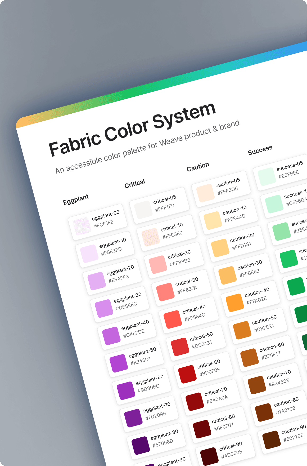
I started this as a passion project, auditing our colors against WCAG guidelines and documenting every contrast failure. Rather than patching problems individually, I designed a systematic solution using HSL color models.
I created color families with tints and shades from 0 (white) to 100 (black) in increments of 10. The key innovation: any two colors 40 values apart guaranteed WCAG AA compliance. A primary-50 button with primary-10 text would pass. This gave designers flexibility within accessibility guardrails.
I built seven color families: primary (blue), seaweed, eggplant, red, yellow, green, and neutrals. I tested every combination with contrast checkers and validating against real product screens.
The Resistance
The hardest part wasn't the math; it was getting buy-in. I presented four times over four months to the marketing team to drive consistency, and with product and engineering teams who were resistant to non-feature work. What finally broke through: legal risk, user experience, and brand consistency. As Weave approached IPO, becoming public meant adhering to accessibility standards or risking legal action. Users were struggling. And our inconsistent branding confused prospects.
The Results
The system launched in 2021, improving contrast ratios from 2:1 to 4.5:1+. Without dedicated resources, we implemented through a Figma style library with hardcoded values– pragmatic, not ideal, but it worked.
The darker blue tiles on the home screen generated immediate complaints. I ran a live A/B test comparing filled tiles against a lighter stroke-only variant. Due to the lighter visual weight, users had a preference for the stroke variant.
By 2025, the palette expanded to include additional families like tangerine, rose, and indigo, and the team finally began implementing design tokens.
What Changed My Practice
I learned that design systems work is organizational change management. The mathematical elegance meant nothing if teams wouldn't implement it. I now lead with business impact first, design quality second. The IPO risk opened doors that the "this is the right thing to do" argument couldn't.
I also learned when to accept "good enough." I'd hoped to fully unify product and marketing palettes, but achieving separate-yet-similar was still a win. Both teams met accessibility standards, and we looked cohesive enough to feel like one brand. Perfect alignment would have delayed implementation indefinitely.
Most importantly: don't wait for permission to solve problems. Taking initiative created momentum that led to buy-in.
Bottom Line
Accessibility isn't just compliance–it's clarity, usability, and brand integrity. The color system didn't just help us avoid legal risk. It made our product easier to use for everyone and made us look like a company that cares about craft.
The hardest part of design isn't designing. It's convincing everyone else the problem is worth solving.


